Market Analysis
What does it mean Pata ? Im confused.
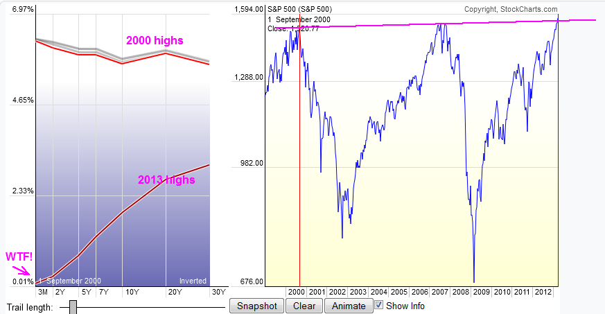
Note the difference in both absolute values and curve slope on the right hand side for each of SPX tops , it is Amazing how cheap money is now compared to previous highs . Meaning of course that money printing is being hectic now
Roger that, thanks mate
Great charts Pata. Love this stuff.I'm covering down here. There is some funny business (Feds, G20) going on.
Well done , I think tomorrow there will be opp to reload GL

What does it mean Pata ? Im confused.
ReplyDeleteNote the difference in both absolute values and curve slope on the right hand side for each of SPX tops , it is Amazing how cheap money is now compared to previous highs . Meaning of course that money printing is being hectic now
ReplyDeleteRoger that, thanks mate
ReplyDeleteGreat charts Pata. Love this stuff.
ReplyDeleteI'm covering down here. There is some funny business (Feds, G20) going on.
Well done , I think tomorrow there will be opp to reload
DeleteGL